Saturday, July 25, 2020

Lazy Girl: Episode 2

Seaside Style
On a warm July day, when ice cubes clink in glasses raised on sun-kissed decks, when children are coming home bedraggled and dripping from their swims, and weary from their sailing lessons on the bay, and throughout the village lawn mowers are silenced for the evening, this is the Golden Hour in Orient.

The hour when two sisters meet for a glass of white wine. Sighing at the cool beauty of it all. The sparkling water, the lavender haze of Russian Sage, the Yarrow, now brownish and awaiting pruning ere it may bloom again in yellow bliss and the bunnies seeking supper among the clover and tender grasses on the lawn. The errant, yet adored Thistle, loved for its purple hue, stalwart in the sea grass.
 Carol Markel
Jeanne Markel
The cocktails are but a prelude to our romp about
the village, accompanied by our Director of Photography,
Jack Wedge.
 Stopping by an artist's studio on a sunny afternoon,
we are at the William Steeple Davis house and studio.
Born in 1884, Davis was a painter, printmaker
 and photographer who lived in Orient all his life.
He established a trust for artists to live and work
in his house and studio.
Darlene Charneco, who creates mixed media
mapping series, is the current resident.
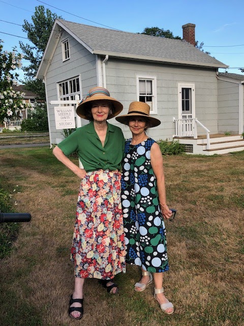
On Carol
Hat by Lola. Blouse and skirt:
Carol's personal vintage Cacharel.
On Jeanne
Straw Amish hat:
Dress by Marimekko for Uniqlo
 A charming picket fence provides a rustic backdrop.
Cacharel was a favorite brand of mine in the 80s when
I lived in Philadelphia. There was a Cacharel store in the
Bourse Building which was built in 1891 and
served as a stock exchange before it was repurposed for
chic shops. It also held an Yves St. Laurent boutique,
 Cacharel pressed all the 
French fashion code buttons:
Freshness, Romanticism and Femininity.

Jeanne's dress features
pears and grapes in cool colors framed
perfectly by the fence post pillars.
How fresh she looks in the
Finnish brand's graphic
print so cannily produced by a
collaboration with Japan's Uniqlo brand.
 Hedges provide privacy to this Orient house.
A pop of pink adds color.
 A diminutive cottage has, in summers past,
been rented by an architect.
 My hat by Lola sports an artfully tied
grosgrain ribbon bow.
Jeanne's boater was left at her house by
a forgetful guest.
 We end our journey on a dock with
the Orient Yacht Club in the distance.
A big thank you to our
Director of Photography,
Jack Wedge.
See Jack's imaginative animations

A Bientot!


Thursday, July 9, 2020

A New Season of Lazy Girl Starts Today!

Hydrangea Town
My oh my how long has it been since the last episode of Lazy Girl? Much too long to count. But today it's back, same theme song, same Lazy Girl. I am on the North Fork of Long Island, my go-to summer place. My brother, David, found a cute, little house for me to rent, quite by chance. There is absolutely nothing to rent out here because New Yorkers have left the city in droves for parts where the rabbits roam and the deer and the mosquitoes play.

I am thrilled to be here and to be with family after months of isolation. Adding to my joy at being in the country is my new bike, which I ordered from REI online and had shipped to my sister Jeanne's house here in Orient. Her husband was kind enough to put it together for me. And what a ride. This is the Electra Townie 7 speed in "Curry." It has pink tire rims. The rattan basket is from Trek.  It's a step-through style bike originally designed for ladies of the 1890's to ride with their long skirts. (I made that up.) I love it's graceful curves.
Curry in a Hurry
 There is an embarrassment of riches in this town.
The Hydrangea macrophylla are in full bloom and glory.
 The name Hydrangea is from the Greek and means
water vessel because of the shape of the seed capsule.
 The common name of this shrub is Hortensia, a Latinized version 
of the French name, Hortense. Are you expecting a
girl baby? Name her Hortense.
 Hydrangea can be blue, violet or pink
depending on the soil pH. If the soil is acidic,
the flowers will be blue. If alkaline, they will be pink.
The Orient Country Store is open, but you
cannot go in. Window service only with
appropriate masks and physical spacing.

A Bientot!


Friday, June 5, 2020

The Art of Richard Cramer: Chapter 3

A Mosaic Brightens Broad Street
When Temple University in Philadelphia wanted to engage artists for a campus improvement program, they turned to Richard Cramer, Professor of Painting at their Tyler School of Art and Architecture.

For Temple's Centennial Challenge project, Richard designed a mosaic which was installed at the Student/Faculty Center on the Health Sciences Campus at the corner of Broad and Ontario Streets. "Palisade," a 12 by 19 foot glass mosaic, was completed in 1981. The mosaic was fabricated by Crovatto Mosaics of Yonkers, New York.

The mosaic tiles, or tesseraes, are small blocks of colored, opaque glass manufactured in Italy in a town near Venice.  Costante Crovatto, a master craftsman, came to New York from Italy to oversee the business. They typically made and installed 12 mosaics a year, mostly for churches, but also for well-known artists like Romare Bearden, Roger Brown and Jack Beal.
Richard choosing colors for the mosaic at
 the Crovatto workshop in Yonkers.
When we arrived, the tiles were randomly placed
 in the display case. I arranged them according to hue 
so Richard could make his choices relative to the other colors.
"Palisade" mosaic in the entryway to the
Student/Faculty Center, Health Sciences Campus,
Temple University, Philadelphia
 Drawings for "Palisade" in Richard's studio.
Typically, the artist did not do a full-size drawing for Crovatto.
Instead the artist painted a small-scale model which
 the artisans at Crovatto interpreted, choosing the tile colors 
and enlarging the image to its final size.
Richard created an actual-size drawing for the mosaic and
choose the colors for each section. This is a detail of the drawing.
In progress mosaic on the floor at the Crovatto workshop.
 The tiles were glued to a paper in reverse in the Crovatto workshop.
At the site they were installed on the wall and the backing paper removed.
 Finally the tiles were wiped clean to reveal the
gleaming glass surface.
Richard in front of "Palisade."
 A few years ago we visited places in Philadelphia
where Richard had made a contribution to the city and to his students.
Richard with his son, Richard, and his daughter, Dianna.
Richard and Carol in front of gorgeous color.
Our trip included the garden on the Temple Campus
where Richard's name joins other Temple Faculty
winners of the Great Teachers Award.
With the money from his award, Richard established
the Richard Cramer Color Award for a graduating Senior painter.
The Color Award has been enhanced by the generous donations
made by friends in his honor.

Thank you.

I would also like to thank my friend and neighbor,
 Renata Delsignore,
for her generous gift of a film-to-digital converter which
enabled me to convert slides for this post.
Thanks, Renata!

A Bientot!


Tuesday, May 5, 2020

The Art of Richard Cramer: Chapter 2

The Just-Noticeable Difference of Colors
In 1975, Richard and I moved to a pre-civil war building on Chestnut Street in Philadelphia. It was over 4,000 square feet of live-work space on the third and fourth floors. We painted it white and most of our furniture was on castors. Richard's domain was the third floor where he set up his elaborate studio consisting of tables that he designed and made, glass palettes and a big table in the middle on which the actual painting was laid flat.
Richard in his studio in 1978.
Waverly, 1977 
acrylic on canvas in 5 panels
6 feet 4 inches high x 6 feet 8 inches wide
Collection of Smith Kline Beckmann, Philadelphia

The inspiration for Richard's work came from a sense of place, for example the Arizona dessert or the view from our windows. To match this interior quality, he mixed what he called base colors. These in turn generated thousands of other colors, such as you see in Waverly. Richard creating a quantitative mix system for pigments that used exact measurements.
I am interested in threshold levels of minimal change. Colors that are mixed in extremely fine steps to that point of "just noticeable difference". Richard Cramer
A mixing table set up.
Richard hired assistants to mix the colors based on his formulas.
Dave Landry (against wall) and Steve Kraitchman 
at work in the studio. Richard's diagrams
 for color mixing are on the wall.
Jars containing base colors. We lived near Old City
in Philadelphia, and there were businesses selling
chinaware and glassware in the area. We had a ready supply of jars.
 Richard wrote out this formula for his favorite color, Red 47A.
He gave it to Andy Hornberger who recently sent me this photo.
 Richard's studio. It was very hot in the summer.
We had custom tinted shades made for the 10 foot windows.
The view from Richard's studio looking out on 
Chestnut Street at sunset.
The colors and shapes were part of the inspiration
for his paintings.
Richard Cramer on the roof at 723 Chestnut Street,
Philadelphia. The Strawbridge and Clothier department
store is in the background.
Carol at 723 Chestnut Street.
Richard and I had matching hats.

A Bientot!


Thursday, April 23, 2020

The Art of Richard Cramer: Chapter 1

Richard Cramer:
His Life in Art
My husband, Richard Cramer, who devoted his life to making and teaching art, died on April 10, 2020. He was 87 and had contracted Covid-19. I have often written on this blog about our wonderful life over the span of our 54 years together.

I also want to create a testament to his art, because I believe he was a genius at what he did. For a decade, from 1970 to 1980, Richard made hundreds of color-field paintings, collages, drawings and prints using his proprietary color-mixing system. But do not jump to a conclusion that because he used a system, his work was not poetic. Because that's what it was. It was all about a sense of place. 

Richard grew up in Neenah, Wisconsin. His family owned a small farm which was bordered by a swamp formed by the backwaters of Lake Winnebago. Richard wrote: "There were many animals -- birds, mink and fish, whose shapes and skins were reflected in the light of the water. The integration of these forms in nature and their reflective light has been a constant source for me."

While in the Army, he looked at the static forms of mountains along the Arizona-Mexico border and took in the light of the desert. He said, "My art is based on instinctual response and the belief that light and color are most primal."
Richard in our studio at 39 North 10th Street, Philadelphia,
sometime in the early 70s. 
Prairie du Chien
Richard's first color-field painting completed in 1973.
This painting is 6 feet high by 12 feet long.
 It's comprised of two 6 foot squares placed side by side.
Acrylic on canvas.
 On the wall in the studio at 39 North 10th is 
a color study for Prairie du Chien.
The study consists of 4x5" swatches of "base colors".
Richard invented a color-mixing system to cross mix the
base colors in such a way to create the flairs of color in Prairie du Chien.
The painting is laying flat on a table in the foreground.
The Process
Behind the poetry is the process and Richard's was elaborate. His goal was to create "just noticeable differences" between colors. There are 6,000 different colors in Prairie du Chien. So instead of one absolute color, like you would see in a painting by Ellsworth Kelly, the multitude of colors distinguished by minute changes shimmer across the picture plane to evoke interpretations of light and ambience. 

The individual colors were contained within small, rectangular units. Each unit was taped off with masking tape which Richard had custom made for him in a specific width. The base colors provided the starting point for the color mixing. Once Richard created the formulas for the colors, an assistant actually mixed the paint. He then applied the paint to the canvas in two coats. This created a ridge which captured additional light.
Center: Nancy Anello who was Richard's studio assistant 
for Prairie du Chien.
Ed Fink is on the left and Richard is busy opening
a wine bottle. This must have been a Color Class review.
The Assistant: Nancy Anello 
Nancy Anello, who graduated from Tyler School of Art and Architecture in 1973, was Richard's assistant for Prairie du Chien. We have kept in touch with Nancy, and she sent me this remembrance of Richard:
"I became a painting major because of him. I loved the Color Course. He inspired me and countless other students. I loved working for him mixing colors from his huge catalogue of color swatches. He hired me to help him mix colors for Prairie du Chien, his first color field painting. That was a wonderful summer, working in Richard's studio and having wonderful meals together, that you prepared. I remember raspberries and cream for dessert and Richard rationing himself to only one Heineken, which he immensely enjoyed."
After graduating from Tyler, Nancy received her MFA degree from the San Francisco Art Institute. She became a master printer for Crown Point Press. Her own art work has always incorporated beautiful color. She is a color soul mate and has done hand-printed batik fabric and clothing inspired by her many years of living in Bali, Indonesia. An intrepid traveler, Nancy recently toured India and posted many color-inspired photos on Instagram @nancyanello.
Carol Markel in the 39 North 10th Street Studio.
Richard bought me the green Givenchy sweater at the
Tribout Shop in the John Wanamker department store.
We had more objects back then which we had fun collecting
at flea markets and the alleys of our neighborhood in Philly.

A Bientot!


Monday, January 20, 2020

The 2020 Outsider Art Fair

DJM at The Outsider Art Fair

This year's Outsider Art Fair was special to the Markels because our brother, David Markel, had three works in the show at the Metropolitan Pavilion in New York City. He was represented by Wilsonville of East Hampton, N.Y. My sister, Jeanne Markel, friend, Sarah Prescott, and I joined David on a visit to the fair on a cold January day.

The Fair is a dizzying array of works which attract you as you zig-zag your way through the booths. One must be well fortified to keep up the mental and physical energy necessary to absorb it all.
Collage by Della Wells
Portrait Society Gallery Milwaukee, WI
DJM, David Markel, at the entrance to the Fair.
Photo by Jeanne Markel
 Painting by David Markel
Two of David's smaller paintings.
Tony Nickalls of the Portrait Society Gallery
wearing a dress by Rosemary Ollison.
Ollison's repurposed fabric "flowers" are on the
wall and floor.
David Markel, Mark Wilson, Jeanne Markel and Carol Markel
Photo by Sarah Prescott via Facebook Post
I can't resist a girl with a hat and a flower.
Photo by Jeanne Markel

Two colored pencil on paper drawings by
Minnie Evans from Hirschl & Adler Modern
 Chairs carved from a single piece of wood
Leon Thiebauld
Bottle People by Fred Palmer
A whole village of wooden people by a Canadian artist.
 Sarah Prescott, Mark Wilson, David Markel and Jeanne Markel

 Lunch after the Fair at Westville.
Photo by Jeanne Markel
Selfie, David and Jeanne.

A Bientot!